It’s the most ocean-friendly map ever created. Why haven’t more people seen it?

By Evan Lubofsky | March 25, 2026
The first time I saw the Spilhaus Projection map of the world, my brain hurt.
It wasn’t in a book, a monitor, or even on a wall. It was on a T-shirt — one I came upon as I was rummaging through a pile of neatly stacked shirts at the WHOI Visitor's Center on Water Street in Woods Hole.
I can’t recall if I did a double take, or possibly triple, when I held up the shirt. But visually, the silkscreened image was hard to process. It was like someone had taken the world map we’ve become accustomed to seeing since grade school and went at it with a tenderizing hammer, splaying continental landmasses and coastlines out to the edges in order to put the focus on something most world maps tend to hide: a single, uninterrupted global ocean.
Now that’s interesting, I thought. In ocean science, we often talk about the concept of a single connected ocean where seven seas become one. But I hadn’t seen it portrayed that way. Ever.
This inside-out view of the world was created in 1942 by Athelstan Spilhaus, a South African-born geophysicist who joined WHOI in 1936 as a physical oceanographer and developed the bathythermograph to measure ocean depths and temperatures. Spilhaus clearly must have felt that the ocean wasn’t getting the props it deserved and that somehow, the ocean, which covers 71% of the Earth’s surface, had been lost in the shadows of a terrestrial world centered mainly around England, where most 20th-centrury cartographers had lived.
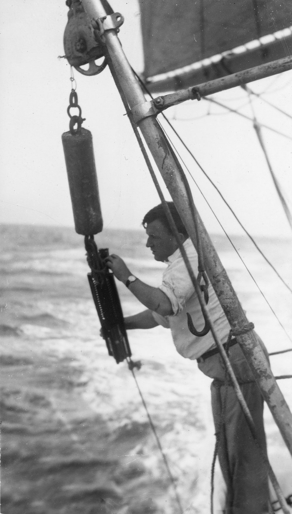
Spilhaus on the deck of the R/V Atlantis deploying an
early version of the bathythermograph.
(Photo by Alfred Woodcock, © Woods Hole Oceanographic Institution)
A world map focused on the ocean was Spilhaus’s answer to land-biased maps. “That the world ocean is a continuous body of water with relatively free interchange between its parts is of fundamental importance to oceanography,” he wrote in a July 1942 paper in Geographical Review. “Because it covers more than two-thirds of the Earth's surface, a map of the world ocean is essentially a world map.” It was a cartographic way to make people more aware about this vast, interconnected body of water that produces more than half of the oxygen we breathe, regulates our climate, and helps sustain life on Earth. So why hadn’t I ever seen it before? Why haven’t most people?
“It took me a minute or two to wrap my head around it,” said Laura McDonnell, a marine biologist and postdoc in WHOI’s Marine Predator Group, recalling the first time she saw the Spilhaus Projection back in 2021. But as she continued to look at it, she had a revelation.
“I had been looking at how large migratory sharks move in the ocean,” she said. “I think a lot about visual boundaries that we have when we look at a regular world map. A large fish, however, doesn’t see these boundaries. They actually see the ocean as the Spilhaus Projection represents it — with no borders and a whole lot of blue that’s all connected.”
Physical oceanographers also see utility in the map. WHOI Senior Scientist Glen Gawarkiewicz said it’s fundamentally useful because it shows the interconnectivity of all the ocean basins. And because the Spilhaus Project is centered around the Southern Hemisphere, he added, “it shows what a central role Antarctica and the Southern Ocean plays in the whole global circulation.”
Spilhaus — often nicknamed “Spilly” — was something of a renaissance man. During his career, he was a scientist, inventor, engineer, author, comic strip creator, university dean, school superintendent, sculptor, meteorologist, and advisor to U.S. presidents. It’s hard to know when he had time for cartography (or eating, for that matter).
Yet somehow he did. And he knew that making any map came with sacrifices. “All maps distort,” he once said. His own map leaves behind geographic familiarity in order to present the ocean as a single connected body of water, which impairs our normal perception of geographic relationships. The American and Asian continents are torn apart, for example, and the poles are placed in South America and China. It’s far from intuitive, which is likely part of the reason why the map has stayed relatively obscure since it first was published in Smithsonian magazine in 1979.
Not to mention that most of us have a land-centric view of the world. Humans are land animals. Typically, we like to be grounded on solid terrain, where most of the world’s economic activity like agriculture and mining and infrastructure takes place. The world maps we’re used to seeing emphasize countries, territories, and geopolitical borders — nearly all of which exist on land. Sure, borders like the Exclusive Economic Zone exist in the ocean, but they’re not shown on a lot of world maps and most people likely couldn’t spot them.
Despite its radical departure from the traditional worldview, the Spilhaus Map was arguably way ahead of its time. And it may even be more relevant now than it was 84 years ago. You don’t need to look much further than ocean warming, marine pollution, and migrating species to see that the ocean undeniably functions as a vast, interconnected system. Today’s ocean is facing hardships that we should all be aware of. In that respect, the map may be exactly the perspective we need right now.